
A New Western Hero
/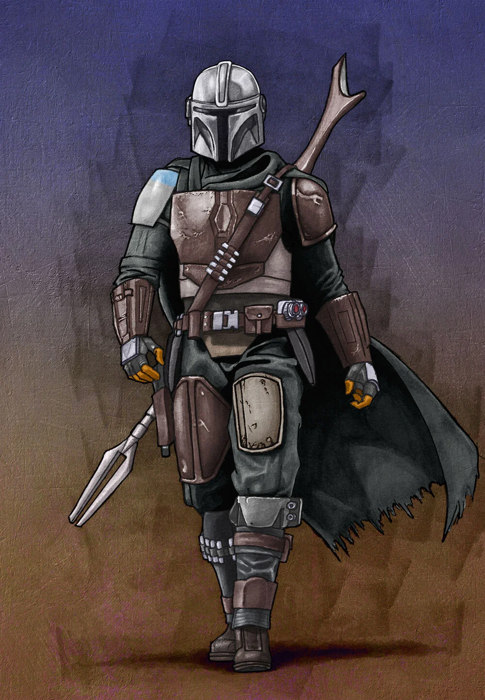
Traditional + digital media. Pencil, pen and copic marker before digital coloring.
I grew up watching and reading Westerns with my father. So when we talked about those stories with friends and family, a lot of the same characters kept popping up. They are America’s mythology with John Wayne being a sort of King Arthur at the head of the round table. The characters of Louis L’amour and Zane Grey sometimes came up. Mostly the Western heroes of cinema loomed over our sense of story and downright coolness. And we didn’t split hairs over where the Western was made. We all watched a lot “Spaghetti Westerns” and never once cared that some movies had righteous heroes and some had dubious anti-heroes. Anytime we would be together looking at the engine of the vehicle someone bought, working on someone’s house, or cleaning birds after a little hunting, conversation always involved some of the same movies. No one was surprised when the names of ‘The Duke’, Clint Eastwood, Lee Marvin, Lee Van Cleef, Katherine Ross, Henry Fonda, Steve McQueen, Raquel Welch, Gary Cooper, Ben Johnson, Yul Brynner, James Coburn, Alan Ladd, or George Kennedy came up. We all chuckled anytime someone would whistle or “wah ooh wah ooh wah” the iconic sounds of A Fistful of Dollars, For a Few Dollars More, or The Good, The Bad, and The Ugly.
Since then, I’ve come to appreciate a lot of westerns made after that era as well. Tombstone, Lonesome Dove, Unforgiven, The Assassination of Jesse James by the Coward Robert Ford, Hi-Lo Country, All the Pretty Horses, Deadwood, et. al. Hell, I liked both iterations of The Magnificent Seven so much that it made me watch The Seven Samurai, which was a gateway drug to the works of Akira Kurosawa, and his contemporaries.

Traditional + digital media. Pencil, pen and copic marker before digital coloring.
I’ve also broadened my definition of a Western. Meaning that, it may not be set in “the old west” of America. The first time I watched The Crow, I remember thinking… “I can’t put my finger on it, but this sure feels like a Western”. The second part of Kill Bill made a lot of creative decisions to make it feel like a Western. No Country for Old Men and Hell or High Water are perhaps two of the best examples I can think of when it comes to “not really westerns… but totally damn good westerns” movies.
I am an American male born the same year that the first Star Wars movie was released. So it is a safe assumption that I am a fan of the franchise. I mean, I’m 42 and here I am at Disney World posing with a guy just because he is really tall and wearing a Chewbacca costume.

I know that Westerns have always been in the DNA of Star Wars. But when I saw how the new Disney+ series The Mandalorian not only embraced that heritage, but celebrated it, I took notice. The protagonist uses few words but is quick and true with is weapons. He also has a code that he lives by. He is in so many ways, the quintessential Western hero. I know it’s super popular now for artists to draw the Mandalorian and “The Child”. But I really wanted to make this little piece as a synthesis of of my admiration for the archetypes I grew up with in story and in real life (looking at you, sons of Lloyd & Dory Scoblic and Derald & Margaret Hay), as well as those great archetypes being practically changeless in modern storytelling.


